As my co-host Shawn Engel and I have discussed on episodes of Parallel Lines: The DC Comics Tangent Universe Podcast, one of the more eye-catching features of the Tangent lines of books — noticeable even before opening the cover of a single issue — is the distinctive trade dress and logo designs on the covers. Compared to other books on the stands during the first wave in 1997 and the second a year later, the Tangent books stand out amid a mostly homogeneous group of late-’90s comic covers.
The man largely responsible for giving the books their unique look was Rian Hughes, a British designer and artist with many credits both in and out of the world of comic books. In this exclusive interview, Rian was kind enough to spend a little time talking about his work on the Tangent line
How did you get the job of designing the logos and trade dress, and did you do all 18 books (nine each from 1997 and 1998), as well as the line itself?
RIAN: I think it was Curtis King at DC who requested that I get involved. Curtis is a great art director, and the fact the series has a distinctive cohesive look is down to his steering the project through all the multiple creators wishes to completion.
 It broke down as follows: I designed the logos and the trade dress issue by issue for the first series, then (if I recall) just the logos for the second series, with DC reusing the existing layouts I’d put together.
For the more recent tie-ins like Superman’s Reign I just did the logos, and the issues were put together in house again to my previous designs.
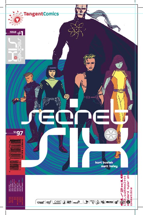
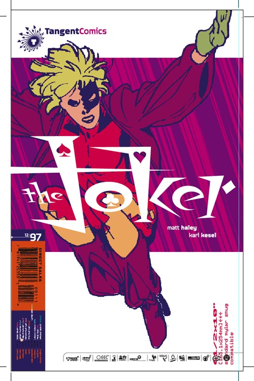
Each issue has a similar trade dress and graphic background — lines, curves — in two colours that I fitted around the poses the artists finally sent me. The prices and other cover information is listed in several languages, a nod to an imagined global reach a modern comic might have, and there is a row of informational logos along the bottom that evoke the kind of logo-heavy indicia you might find on pharmaceutical packaging, or the reverse of toy packaging. All these little details add to the idea that these comics come from another world, another Earth where comics are similar, but not exactly the same as the ones we’re familiar with. They’re perhaps from year into the future…
What was your approach/creative process for the logos and trade dress? How much did you know about the books prior to designing the logos?
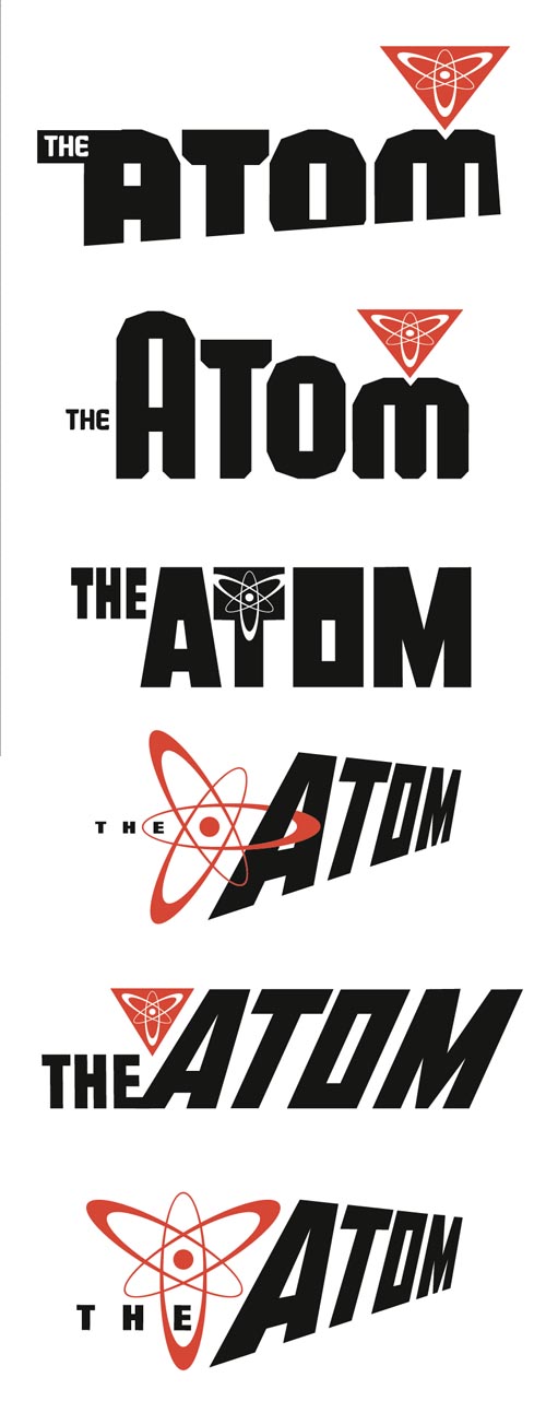
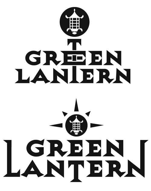
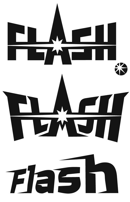
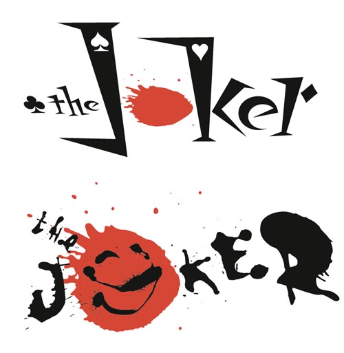
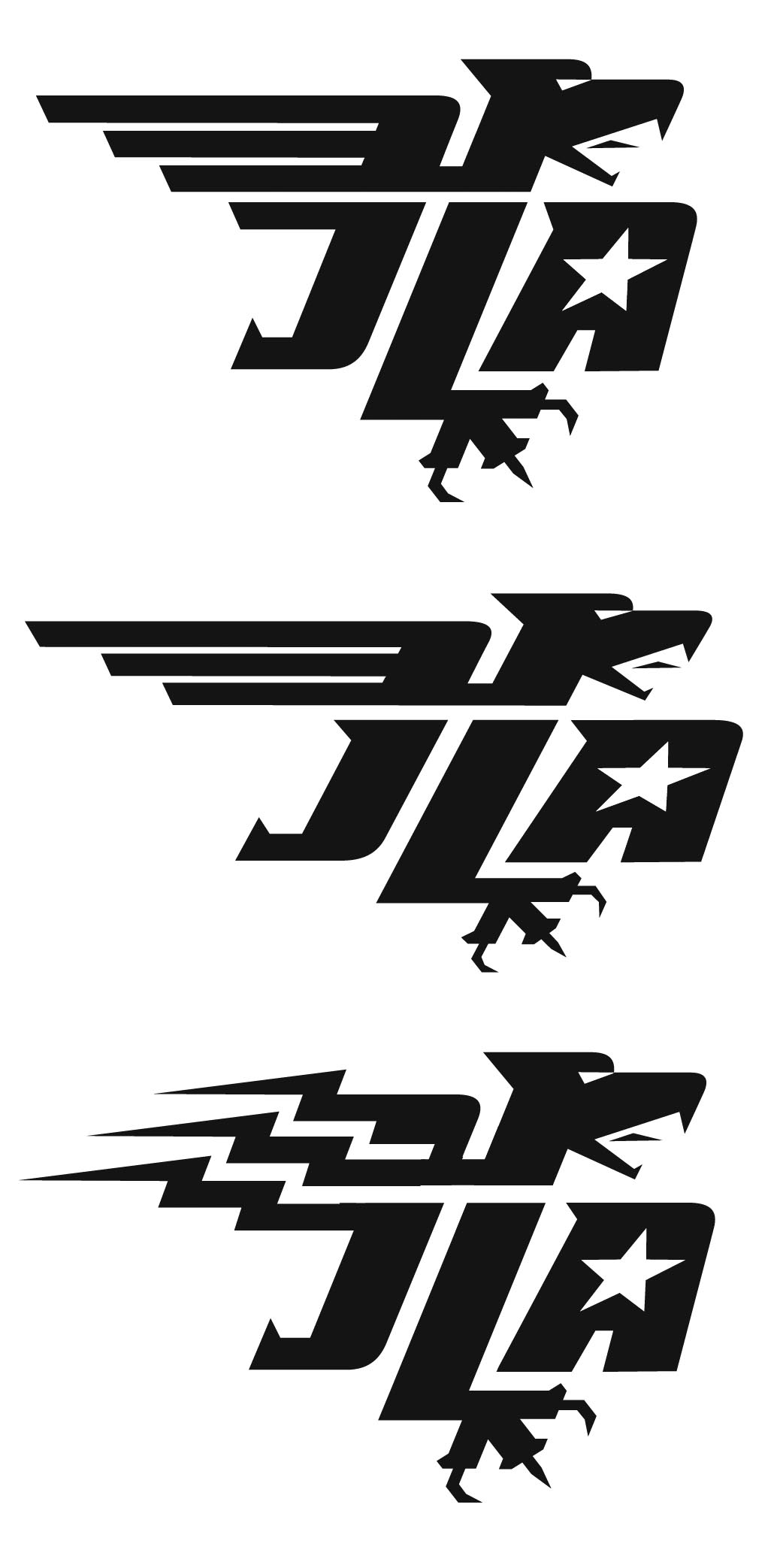
RIAN: Well, we’re going back a while now… I was sent the writer’s pitch for each character, so I knew the style and flavour of each new “take”. I tried to sum up the personality of each in their logo, while using the trade dress to unite the line.
What are the biggest obstacles you faced on the project?
RIAN: There were many teams involved, so I first mocked up the line using existing art to show them how I thought it should look, to demonstrate the idea. The artists then drew their own poses, keeping it to just the characters in isolation, without backgrounds. I then cropped and angled the images to add to an off-centre dynamism — I was determined to not have the logos across the top, like a standard comic. The two-tone graphic backgrounds were added at this stage.
 I also specified that the colouring should be done in a unified fashion as well, again to tie the books together visually. It was important at the outset to convince the artists that my idea was going to look good, and to get them all on board with it!
How do you feel about the logos today? Looking back, is there anything you would’ve done different?
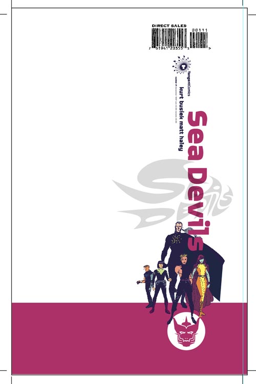
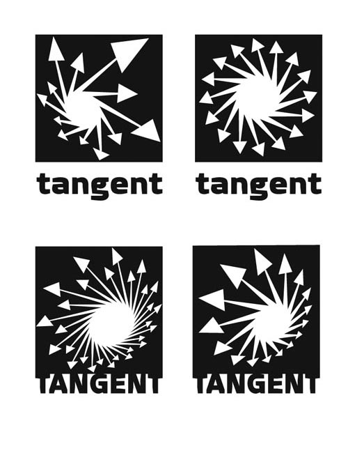
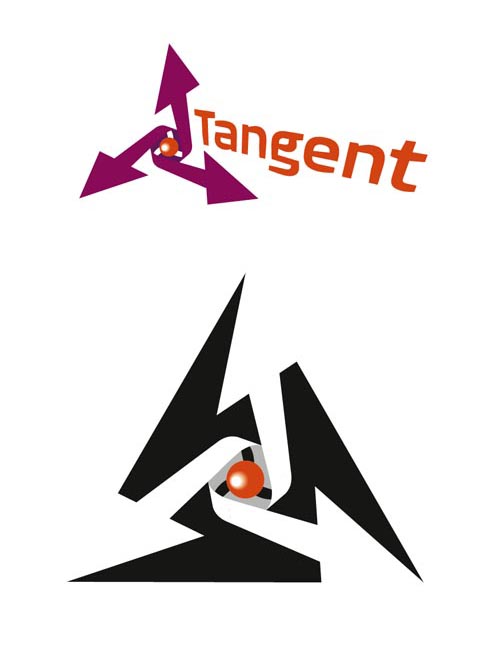
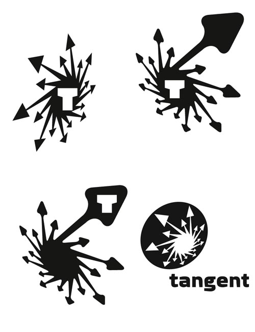
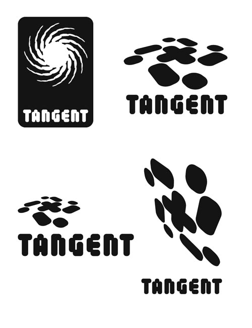
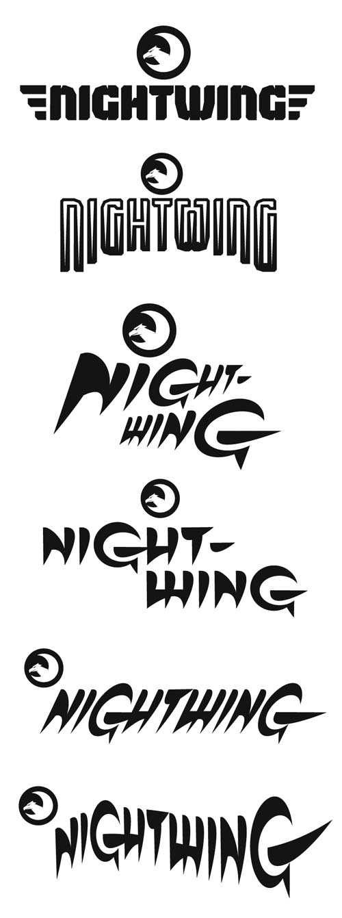
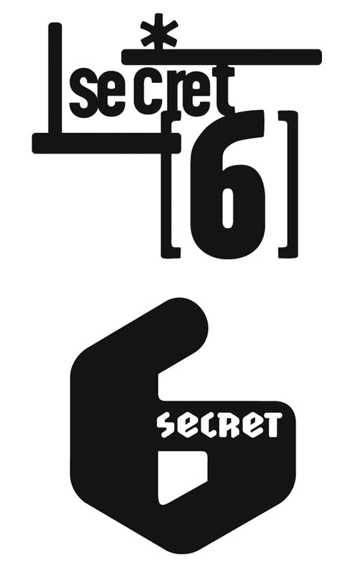
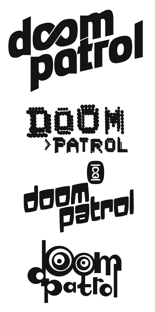
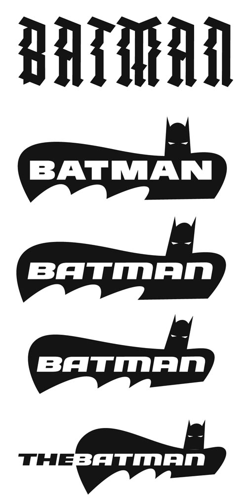
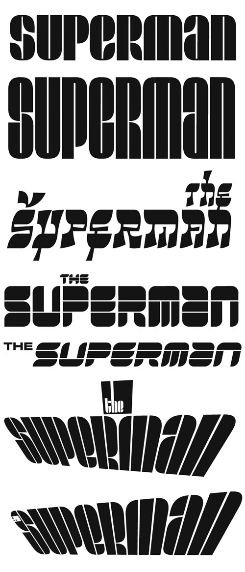
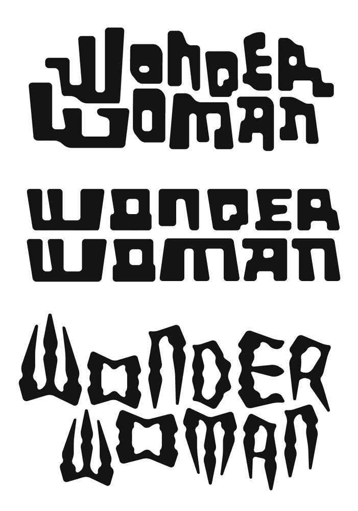
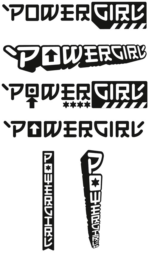
RIAN: I think they’ve weathered rather well. Sea Devils and Metal Men are still some of my favourites out of all of the logos I’ve done. Some are stronger than others — often that was because some of the characters had stronger looks, or backstories, that I could pull something from. Wonder Woman was the one I struggled with the most, and we ended up with something that’s a cross between the detailing on the character’s headdress and the original script-style logo from the William Marston Moulton era. Each logo had a little inset icon that was repeated smaller along the bottom — again, the intentional information overload.
What are you working on now? Anything upcoming you’d like to plug?
RIAN: The Multiversity Map that Grant Morrison came up with and I designed — that is probably the most complicated single piece of design I’ve ever done. That leads into the design of the Multiversity series itself, which I’m about half-way through designing. I’ve just released, via Blurb, a catalogue of Device Fonts Collection 15, which is given over entirely to numbers. I wrote and drew a strip for Magenta, Vertigo’s quarterly, that’s just out; Valiant have some very interesting new books in the works that I’m designing logos for, and the sequel to my burlesque art book, Soho Dives, Soho Divas is almost finished. Go buy the first one so it sells out and I can get the new one done sooner! Other than that — the usual eclectic mishmash of illustration, type and design work.
Thank you for your willingness to do this and let me publish it.
No problem.
Rian later sent a postscript noting: “In designing the Multiverse map, I considered the look of each different Earth — and as there’s a Tangent Earth, I dropped in the circular swirly shape from the original Sea Devils cover I designed, back in the day. No-one has noticed so far…”
It’s great not only to hear the Tangent Earth is still part of the post-New 52 multiverse, but that Rian was able to incorporate some of his original work to indicate that. Hopefully if there is a visit to the Tangent universe down the road, Rian will be a part of it!
Come back tomorrow for a look closer look at Rian’s logos, as well as some long-unseen concept work and unused design ideas from the Tangent series.
Once again, thanks to Rian for making time in his busy schedule to talk about his work giving the Tangent their distinctive look. Be sure to check out his site, Device for more samples of his design, font and illustration work.